Case Study: Boston Pizza - Brand Refresh
Role
Front End Developer at Digital On Six, 2022 - 2026
Technologies
AEM, React, Tailwind, JavaScript, Google Maps
The challenge
When a national brand undertakes its first major rebrand in over 60 years, the challenge extends far beyond a visual refresh. The existing digital experience had several foundational issues to address, including an outdated content hierarchy that impacted accessibility, inconsistent layout alignment between standard and custom components, subpar responsive behaviour, and a legacy store locator prone to crashing in common use cases. The goal was to build a more consistent, accessible, and resilient experience that would support the new brand identity while reducing long-term maintenance and dependency on our team.
My role
Co-led the front-end implementation of standardized and custom components, creating a cohesive brand experience with improved accessibility as a top priority. Independently led the evaluation and refactoring of the store locator, migrating a legacy class-based React implementation of Google Maps to a more modern, maintainable Hooks architecture.
Building the new experience
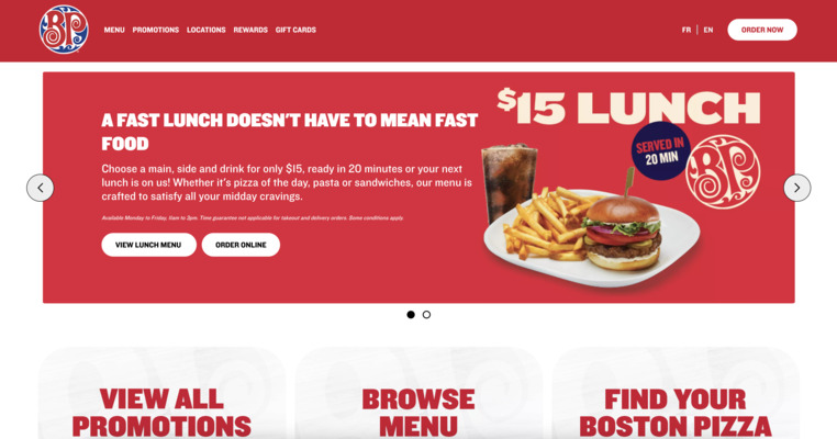
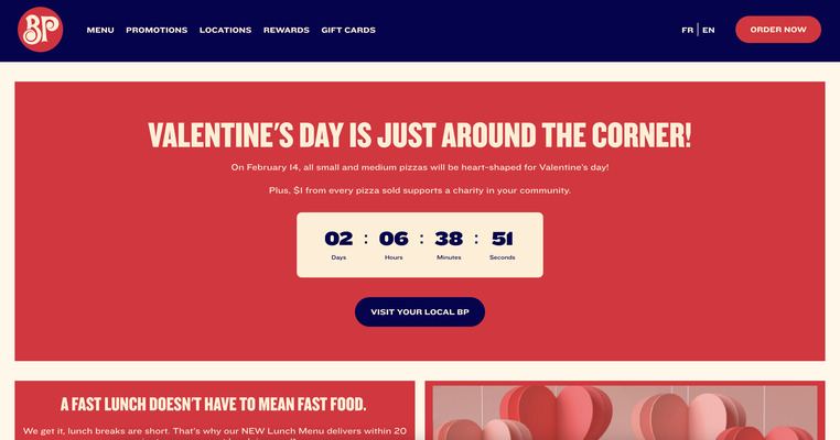
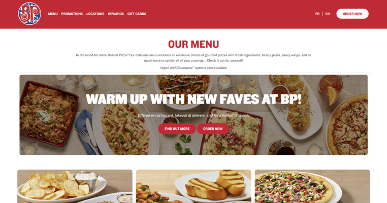
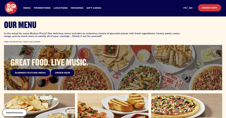
The rebrand introduced a new typography system, softer colour palette, and a more contemporary brand voice across the Boston Pizza website. While much of the previous experience relied on standard AEM components, the new design direction called for a more bespoke component approach to better support the flexibility, consistency, and visual language of the refreshed brand.
As part of the rebuild, we developed a more streamlined authoring experience with improved accessibility through more semantic markup, keyboard navigation, and clearer heading structures, as well as improved responsive behaviour across components. We also introduced new custom components where existing functionality could no longer meet the needs of the redesigned experience, creating a more flexible foundation for the continued evolution of the Boston Pizza website in Canada.
Progressive modernization of the store locator
Concerns from franchisees about customers having difficulty finding restaurant locations in certain geographic regions were a key driver behind the decision to modernize the store locator. Rather than pursue a full rebuild, I recommended a progressive refactoring approach that balanced project timelines and cost with the need to preserve familiar functionality, work within the existing technology stack, and align the experience with the broader website rebrand.
I began by evaluating the existing user experience and codebase to identify the highest-priority issues and understand how the existing functionality was interconnected. From there, I developed an incremental implementation plan that would allow the underlying architecture to be modernized without introducing unnecessary rework or disrupting functionality that customers already relied on.
The existing implementation used class-based React, while its integration with the Google Maps API was already functional. This provided an opportunity to leverage my experience with React Hooks and modernize the structure of the application while retaining the core technologies that were already working. The result was a cleaner and more flexible foundation that could accommodate the improvements identified during the initial evaluation.
Before introducing the new functionality, I focused on validating that the refactored implementation remained at least functionally equivalent to the existing experience. Extensive manual testing across our geographically distributed team combined with AI-assisted debugging during development helped surface and resolve issues quickly while giving us confidence to progressively introduce the planned improvements.
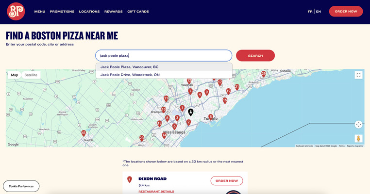
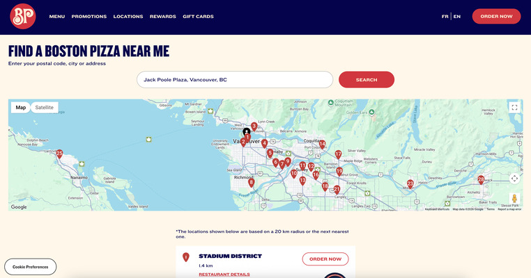
The modernized store locator ultimately launched with a range of improvements, including a substantial lift in accessibility. An unexpected benefit emerged from the refactoring as well: the store locator shared functionality with the client's annual giving campaign, where donors were required to associate their contribution with a specific restaurant location. Improvements to the underlying functionality significantly reduced erroneous submissions during the campaign, extending the value of the work beyond the original scope.
For me, this was one of the most rewarding aspects of the project. What began as an effort to address shortcomings in the store locator resulted in a more accessible and maintainable experience, while the flexibility introduced through the refactoring also improved the reliability of another part of the site without requiring a separate implementation.
Outcome
The rebrand successfully delivered a more accessible, consistent, and resilient digital experience for one of Canada's most recognized casual dining brands. Consistent stakeholder communication and close collaboration across organizations helped keep the implementation aligned with the broader goals of the project while creating a stronger foundation for the continued evolution of the site.
While the store locator represented only one part of the overall deliverable, its modernization addressed a longstanding concern around customers being able to reliably find restaurant locations across both urban and remote regions. The improvements also established a stronger benchmark for user experience across the wider site and, through the reuse of shared functionality, helped improve the reliability of the client's annual giving campaign while reducing duplicated code and future maintenance effort.
View more work